The “Shockers” are one of the Ottawa Paramedics’ hockey teams. As they advanced from informal after-work shinny to playing their first tournaments against other city services, they needed an emblem to put on their jerseys and ralley the fans behind.
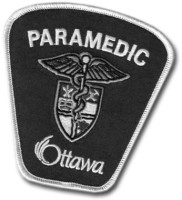 The final design takes the ancient symbol of medicine and healthcare, the ‘Staff of Asclepius’ that also appears in the Ottawa Paramedic Service’s coat of arms, and turns it into a hockey stick giving the snake a tongue-in-cheak aggressive twist.
Alternative Designs
This proposal references the name of the team (which in turn refers to the electric shocks administered by paramedics for cardiac defibrillation)
![]()
![]()
The following two designs are based on rough sketches by John Blythe, who also suggested the Tampa-Bay-inspired colour scheme.
![]()
![]()
![]()
![]()